I finally got around to looking up where I ranked in the November '12 competition. Number 129 out of 284 (so I was in the top half with 4.14 stars, the very top animation recieving 7.51 stars)
Here's the page where my entry is located- 11 Second Club - November Competition
The criticism from the comments included-
-The actions were cliche, i.e. pointing at watch for time, walking in place, and are overacted
-The characters enunciated every word, which they shouldn't do. (Somehow, I sensed I should not have done that- bad self for not asking someone!)
-One person disliked the walking in place while one person thought it was unecessary
-Context was clear (thank goodness! I thought I'd have trouble with that)
-Art style "kinda" matches animation (?) Eh? What does that mean?
I agree with the criticism peoples gave me. Too many literal actions based on speech. People never do what my character did. However, the point I was trying to make was an over-exaggeration. I always enjoy me some Ren n Stimpy-esque animation. But if that's wrong, then, I guess I learned m'lesson.
Next time I do an animation with dialogue, I'll act it out myself in a small room where nobody can see me. Yes, I was told to do this. No, I didn't for that animation. Bad self!!
Saturday, January 5, 2013
Friday, November 30, 2012
Not On the List
I participated (by force) in the 11 Second Club November 2012 competition for the next assignment. The audio had really weird dialogue. It was hard to come up with a story for it. Rough storyboards:


First, I neglected to check the guidelines and therefore my aspect ratio was fullscreen instead of widescreen. So, with 1.5 hours until the deadline, I changed the size (using command + J) but doing this made some random lines disappear from some of the frames, and some of the frames had nothing showing up in them. So I resaved the file, and copied the frame from the fixed file and pasted them to the resized file. But the frames I pasted were now the original fullscreen size. So I resized those as best I could. Then, since the canvas gained a lot of width, the backgrounds weren't big enough (they cut off about 3/4 through each frame because I only drew enough for fullscreen. So I filled in the background. Then I kept having to re-render the video after finding mistakes in the animation.
I really wish there were another file format to export to because Quicktime stinks. The audio quality drops severely even though the "No Compression" option is used. BAH!!
After critique, I added some movement after the "BAM!" to his hands.
When I tried the default codec, some of the frames froze during playback when I uploaded it to Youtube. I dried h.264, and now the frames run fine, but there are a lot more artifacts showing up during playback. So then I tried messing with the "Animation" codec's settings, and got it to show up decently.


Le teacher wanted me to add more camera angles, so I did. (Even though the vast majority of the 11-second-club clips don't change angles.) I think it looks better now.
First, I neglected to check the guidelines and therefore my aspect ratio was fullscreen instead of widescreen. So, with 1.5 hours until the deadline, I changed the size (using command + J) but doing this made some random lines disappear from some of the frames, and some of the frames had nothing showing up in them. So I resaved the file, and copied the frame from the fixed file and pasted them to the resized file. But the frames I pasted were now the original fullscreen size. So I resized those as best I could. Then, since the canvas gained a lot of width, the backgrounds weren't big enough (they cut off about 3/4 through each frame because I only drew enough for fullscreen. So I filled in the background. Then I kept having to re-render the video after finding mistakes in the animation.
I really wish there were another file format to export to because Quicktime stinks. The audio quality drops severely even though the "No Compression" option is used. BAH!!
After critique, I added some movement after the "BAM!" to his hands.
Here is the fullscreen version:
When I tried the default codec, some of the frames froze during playback when I uploaded it to Youtube. I dried h.264, and now the frames run fine, but there are a lot more artifacts showing up during playback. So then I tried messing with the "Animation" codec's settings, and got it to show up decently.
Thursday, November 15, 2012
Horton Hears a Croc
Next assignment - use one of the clips from here and interpret the dialogue your own way and animate that. I chose "Mr. Mayor, are you seriously proposing that we spend the Who centennial on the ground? Like worms?!" I selected a crocodile to be my narrator so I could make his mouth go crazy (as opposed to a character with a flat face on which the mouth sits and moves)
Original storyboards:


The character blocking I did before I started animating can be found here - After critique, I redid the part in which the crocodile yells "ground" - He was redirecting the viewer's attention to the bottom-left of the screen by shoving his hands over there when the focus is always on the right side of the screen.
Here is the final version-
The audio didn't render very well, and it also rendered out of sync- either that, or my animation itself was slightly off with the audio - That can be fixed by moving all of the frames back one space. Also, I didn't make it so that he emphasized certain syllables with his mouth. I made it so his mouth opens about the same width throughout every word. This can be fixed by following the instructions found here.
I accomplished the snappiness I wanted from the animation, but I think some of the movements were a bit fast - I also had a problem with twinning in the first half of the animation and didn't realize it until Jessie pointed it out. (Thank you friend!) So the second half contains less twinning with the hands. I also think the cat's arm movement is awkward right after he jumps.
On the plus, I animated the spit coming out of the croc's mouth quite well I thought
Tuesday, October 2, 2012
Applying the Principles of Animation
Um, I don't know why some of these GIFs upload with errors, but some do - To see them how they ACTUALLY look, please visit the animation gallery at my Deviantart here
Cat Jump

This animation contains:
Squash and Stretch- the cat is squished down a little bit when it prepares for its jump, then stretches out its body during the jump
Anticipation- The cat anticipates the jump by analyzing whether it can clear the height
Staging- The audience should be able to understand what the cat intends to do and does by seeing the counter and the anticipation
Straight-ahead and Pose-to-Pose animation- Drew the keys first then animated in-between
Slow in and Slow out- There are more poses when the cat is sitting than when it is actually in the air - Also, there are more drawings when the cat is at the apex of its jump than at the beginning
Timing and Spacing - There are fewer frames during the fast part of the animation (i.e., when the cat jumps up onto the counter) than during the slower parts (the anticipation, the land)
Arcs- The cat jumps in an arc movement, rather than straight up in the air
Solid drawing (some)- At the beginning of the animation, there appears to be some sense of weight and depth, but it disappears because I animated it in silhouette and a side point of view
Appeal- Apparently, people enjoy watching this thing, and think the cat is cute so... It has appeal
Cat Smash

This animation contains:
Solid drawing - You can tell in this animation that the characters (and hammer) are 3d
Ease in and ease out - The animation goes faster during the middle of an action but goes slower at the end of the action
Exaggeration - Um, dogs can't usually be squashed like a pancake and then pop back up in real life
Follow-through and overlapping - Drag affects the hammer as it swings forward and backward, and as the cat lifts it behind its head, the weight of the hammer causes him to become slightly unbalanced; however, there aren't really any overlapping actions here (that I recognize)
Anticipation - The cat swinging the hammer over its head, as well as the dog's expression, are both done in anticipation of the main action
Squash and Stretch - The hammer is squashed (and so is the dog) and stretched throughout the sequence
Arcs - The hammer swings in an arc forward and backward - to make this more realistic I should have had the cat swing the hammer beside its body to prepare for the hit instead of over its head
Timing and Spacing - There are fewer frames during the fast parts (i.e., when the cat swings the hammer downward) and more during the slower parts
Straight-ahead and Pose-to-Pose animation - The keyframes were drawn out first:

And then the inbetweens were added, and whilst in the middle of the tweens, I started finalizing the linework

Stupid Elf Who Reads Books Backwards

This animation contains:
..color?
I made this primarily because I missed Secondary action in the other two
I'm not even sure this can be called a secondary action because the head-scratch interrupts the reading, instead of overlapping the book reading (um.. onto the next paragraph!!)
Then Quinn pointed out the elf's apparent reading problem- I neglected to check if it was reading the book the correct way before I started to animate -_- (STUPID!)
I didn't want it to appear to read manga, so I tried switching around the frames where its eyes move- I guess that's better

I pretty much went straight-ahead on this animation; How many keyframes can you even have of someone lifting up their arm and scratching themselves? (That's so disgusting)
Maybe it has appeal? I couldn't watch this for more than 15 seconds without getting sick of it. What is appealing about revealing its dandruff problems, I don't even know..
It also contains an arc within the movement of its arm and solid drawing as it's shown from a 3/4 view and appears to have some depth to it as it lifts its hand behind its head

in the meantime, 8-bit hug
Tuesday, September 25, 2012
Learning Principles of Animation from 3ds Max
So, after reading about most of the principles of animation in Mechanics of Motion, I watched the 3ds Max tutorial videos (I did not actually DO them, as I am working in 2d) and expanded my knowledge a bit...Although more in a 3d context but, eh.
Staging is presenting your idea in the clearest, most entertaining way possible.
It consists of setting up storyboards and layouts before animating and finalizing.
You need to make sure to set up your camera so that all the characters and props and background you need are in the shot. Then block out the characters
Character blocking= A character's movements and positions on the stage
Silhouettes are very important in staging- the audience must know exactly what is going on with the characters (they need to be readable immediately). This is important in comics as well.
Which one of these sets of silhouettes reads better in this scenario?

Exaggeration can take the animation beyond reality and explore what they can do with the animation. It can also draw attention to an action so the audience doesn't miss it.
The tutorials didn't really explain this principle in a way I could understand it so I looked it up here
Holding a pose a little longer than natural to exaggerate it may give the audience time to absorb what just happened.
Exaggeration can also be what separates one character from another. Add exaggeration to their actions to develop a certain personality.
Squash and Stretch helps things look less rigid by exaggerating movement while maintaining volume.
The video showed an animation of a wolf creature running. While it was running, they made it so its muscles bulged but still maintained the same volume. They also stretched out his arm midstride so that is appeared longer than natural for a short amount of time. This really improved the look of the animation and made it more fun.
Pose-to-Pose Animation is when you draw the key poses of the figure to help time the animation before you draw the inbetweens. Or, as the tutorials put it, "Making sure everything's timed to the director's approval."
Straight-Ahead Animation is when the animator takes a pose and then starts drawing the actions. Or, "They take a pose and just go for it."
Using a combination of these is a preferable to build an animation- Draw the key poses and then use straight-ahead to fill in the gaps.
Appeal is anything an audience enjoys watching.
The tutorial showed adding appeal through composition and gestures. Adding little secondary movements here and there or exaggerating actions (basically, using the 12 principles) assists the animation in becoming funner to watch.
Here, it explains appeal is "styling to achieve the cosmetically attractive as well as an engaging personality. This doesn't mean to say that all characters should be stereotypically beautiful or handsome, but that our villains are suitably villainous and our heroes worth rooting for."
This explanation makes more sense to me in either 2d or 3d context. Though I'm still confused, I've read over at here some more specific aspects of appeal: aesthetics, distillation, and expressiveness.
Follow-Through and Overlapping is basically making sure that all parts of your animation have realistic movements and are affected by the laws of physics such as drag, mass, momentum, inertia, and force.
If a character is in a walk cycle, their arms will swing from side to side to balance the movement of their feet shifting forward and backward. If they stop, their arms may swing forward a little bit from the momentum of the body's movement. If a character turns their head, their hair may drag behind them a little as it has been sitting there and its inertia keeps it from moving forward immediately.
Overlapping actions are multiple independent actions that move at their own pace all caused by the main action or helping the main action happen.
Solid drawing is checking for depth, weight, and balance while making sure the poses are as clear as possible.
I was extremely confused on what this was from watching the video, so I looked it up here
It is important to apply solid drawing so your character doesn't appear flat and unrealistic. Avoid twinning. Try drawing things from an angle rather than straight-on to make it appear more natural.
Twinning= Mirroring an action on both sides of the body- a character's hands may appear parallel and even doing the exact same thing

Staging is presenting your idea in the clearest, most entertaining way possible.
It consists of setting up storyboards and layouts before animating and finalizing.
You need to make sure to set up your camera so that all the characters and props and background you need are in the shot. Then block out the characters
Character blocking= A character's movements and positions on the stage
Silhouettes are very important in staging- the audience must know exactly what is going on with the characters (they need to be readable immediately). This is important in comics as well.
Which one of these sets of silhouettes reads better in this scenario?

You can probably tell the first character is angry and the other is frightened in the second one. The first set of silhouettes is vague; the elf could be telling the fox a fun fact about gorillas for all we know. Get the hands clear of the body.
Of course, not it may look like the elf's trying to scare the fox...uh oh '^_^ On to the next principle...
Of course, not it may look like the elf's trying to scare the fox...uh oh '^_^ On to the next principle...
Anticipation is the buildup to an action.
Consists of 3 parts:
1. Show the audience what you're about to do
2. Carry out the action
3. Show the audience what you've done
Sometimes there is no anticipation for an action, for example if a character is about to be hit by a large object or run into a doorframe they don't expect it. Try planning out the action before you start animating it- act it out first.
Remember that the body is never completely still. (Unless it's dead...) Anticipation helps the audience understand what's happening and makes the action more realistic.
Contrasting anticipation is when a character anticipates something but it falls through and doesn't happen. (A character may be pondering life, then suddenly a great idea pops into his head, but he realizes it can't work so he goes back to normal).
Ease in and Ease out (or Slow in/out) is timing actions so that they don't seem too abrupt.
Easing into an action cushions the movement for realism so the audience doesn't miss an important gesture.
Blinking is a good example of how this principle makes a difference- are they blinking quickly? slowly? rapidly? Blink speed says a lot about how a character is feeling.
When to not use it:
Some cartoons, such as Ren & Stimpy, prefer a snappier animation- characters jump into poses quickly to exaggerate and add humor (and boy, is it humorous..) If you go that way, your keyframes had better be good.
Also, if a character is about to be hit by a heavy object, the character should not slowly ease out of the sudden blast of momentum and force, but show a quicker transition from "not-hit" to "hit (violently and painfully)," though after they are on the ground twitching from pain you may use the ease out to show their follow-through.
If a character is suddenly frightened, excited, or shocked by something, you may not want to ease in either.
Arcs are paths of movement that seem more natural than linear movement.
Again, in nature there are no things that move in mechanic, linear ways. It is more realistic for characters' gestures to move in arcs than in straight lines.
Secondary actions are those that support or enhance a main action.
If a person is walking, then waves at someone, the wave would be the secondary action to compliment the main action (walking)
Timing and Spacing shows the audience how fast things happen.
When setting up keyframes, keep in mind how fast the character will make it to each point. When animating the in-betweens, include more to slow the animation down and more to speed it up. If a character moves from one keyframe with fewer frames, they appear to be moving more quickly.
The timing of one action can completely change the meaning of it. If there is a person sitting down, and another person comes up and asks "What's wrong?" the first person may lift up their arm sluggishly, then slowly point at another hulky person who just took their lunch money. In another scenario, they may quickly lift their arm up and swiftly jab their finger in the direction of a hulky person who just stole their lunch money. The slow motion reveals sadness, the quick one reveals anger and revenge and the desire to steal all the chainsaws in the world and tear apart the person who stole their lunch money. Or annoyance.
The tutorials didn't really explain this principle in a way I could understand it so I looked it up here
Holding a pose a little longer than natural to exaggerate it may give the audience time to absorb what just happened.
Exaggeration can also be what separates one character from another. Add exaggeration to their actions to develop a certain personality.
Squash and Stretch helps things look less rigid by exaggerating movement while maintaining volume.
The video showed an animation of a wolf creature running. While it was running, they made it so its muscles bulged but still maintained the same volume. They also stretched out his arm midstride so that is appeared longer than natural for a short amount of time. This really improved the look of the animation and made it more fun.
Pose-to-Pose Animation is when you draw the key poses of the figure to help time the animation before you draw the inbetweens. Or, as the tutorials put it, "Making sure everything's timed to the director's approval."
Straight-Ahead Animation is when the animator takes a pose and then starts drawing the actions. Or, "They take a pose and just go for it."
Using a combination of these is a preferable to build an animation- Draw the key poses and then use straight-ahead to fill in the gaps.
Appeal is anything an audience enjoys watching.
The tutorial showed adding appeal through composition and gestures. Adding little secondary movements here and there or exaggerating actions (basically, using the 12 principles) assists the animation in becoming funner to watch.
Here, it explains appeal is "styling to achieve the cosmetically attractive as well as an engaging personality. This doesn't mean to say that all characters should be stereotypically beautiful or handsome, but that our villains are suitably villainous and our heroes worth rooting for."
This explanation makes more sense to me in either 2d or 3d context. Though I'm still confused, I've read over at here some more specific aspects of appeal: aesthetics, distillation, and expressiveness.
Follow-Through and Overlapping is basically making sure that all parts of your animation have realistic movements and are affected by the laws of physics such as drag, mass, momentum, inertia, and force.
If a character is in a walk cycle, their arms will swing from side to side to balance the movement of their feet shifting forward and backward. If they stop, their arms may swing forward a little bit from the momentum of the body's movement. If a character turns their head, their hair may drag behind them a little as it has been sitting there and its inertia keeps it from moving forward immediately.
Overlapping actions are multiple independent actions that move at their own pace all caused by the main action or helping the main action happen.
Solid drawing is checking for depth, weight, and balance while making sure the poses are as clear as possible.
I was extremely confused on what this was from watching the video, so I looked it up here
It is important to apply solid drawing so your character doesn't appear flat and unrealistic. Avoid twinning. Try drawing things from an angle rather than straight-on to make it appear more natural.
Twinning= Mirroring an action on both sides of the body- a character's hands may appear parallel and even doing the exact same thing

You aren't designing cardboard cutouts. You may be drawing in 2d, but your drawing is representative of a more complex 3d character or object.
Monday, September 17, 2012
Physics in Animation
The next section of Mechanics of Motion talked more about how we need to imitate real life, for example, linear movements are rare in nature and we should therefore try to avoid them in animation-
Also, when a person performs an action, not every part of their body moves at once. For example, if a guy sits up from a chair, there are many different parts of the body moving at once but in their own ways for their own purpose which all mix together to make the guy exit the chair (overlapping action)

In the top drawing, when the fox turns his body, he doesn't turn every part of himself at once; first his head turns, then his arms start moving, then his hips and legs. His head turns before his body even starts turning. In the both drawings, the fox's head turns in an arc rather than a perfectly
linear motion to keep it looking more natural and interesting. Lastly, in the bottom drawing, when the fox turns his head (again, in an arc), his ears and fur "drag" because of inertia, then when he stops moving they flop forward a little before losing energy and then sitting still again (follow-through motion)
To every movement their are different categories of action; for example, during walking the legs stride, push, and stride again in a cycle, which is the primary action. Their arms also sway from side to side because of the movement of the legs and hips- this is secondary motion. If the person happens to be wearing a cape, the motion of the cape caused by the primary and secondary motions is known as tertiary action. If that person happens to carry a freeze ray, this is known as someone about to steal your money.
Timing in animation
Jeff Price was nice enough to give me 4 books on animation in PDF form- So I started reading the first one, Mechanics of Motion by Chris Webster
After reading about 40 pages in, I realized how much more I needed to pay attention to science class in high school - Animators are trying to imitate life after all, and several rules of science were brought to my attention
The bigger an object is, the more force is takes to get it going then inertia kicks in and keeps it going until it encounters resistance, such as friction (a bouncing ball loses energy and has lower arcs as it hits the ground more times) - Also, large objects have more momentum than small objects and therefore take more force to stop
I also learned the difference between straight-ahead animation and pose-to-pose animation - I should have used the pose-to-pose method in animating my backflipping guy if I wanted to prevent his shrinking and changing proportions
Straight-ahead= draw each frame in order
Pose-to-pose= draw the keyframes and then add the inbetweens
Each has its advantages and disadvantages; pose-to-pose is more structured and will help keep consistent sizes and proportions, while straight-ahead gives you more freedom in animating. Also, pose-to-pose is helpful to animators because if they want to affect the timing, they can add frames between the keyframes more easily
Also, the book brought to my attention the fact that the greater the distance between the same object in two frames, the faster it appears to be moving - If the object is a small distance away in the next frame it appears to be moving more slowly
I tested it out really quickly in Photoshop-

Every time the ball arcs, I added three frames of the ball close to each other then when it fell, I only drew 2 frames- the ball really close to hitting the floor and the ball hitting the floor:

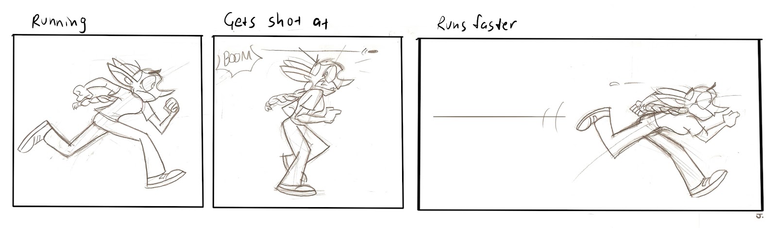
I rested it again on a guy running and hitting a wall (I don't draw walk/run cycles well yet)
I needed to draw more frames.

I don't think you can see it because it's too fast and I need more frames probably, but

He starts off slow and then gets fast because of the distance
Aaand since I'm just as interested in comics as I am in animation, here's how it applies to comics:
In which sequence does the character seem to speed up more?

OR
I believe the second one (..maybe without that line) looks like it sped up because the distance between the character from the last one is increased by making the panel bigger and placing the character on the right side of it
Subscribe to:
Comments (Atom)